
Today I thought I'd talk a little more about the science behind color. It's personally one of my favorite topics, and the more we understand its properties, the more we can make better color choices in everyday life, and in our creative pursuits.
In my painting below, "Poppy Exclamation" I used a few different color techniques to give it the overall feel that I had in mind. My goal was for the poppy to look vibrant, to be inviting, and I also wanted it to feel like it "pops" right off the canvas.

Poppy Exclamation ©
14.5" x 18" watercolor
on 140lb. cotton rag paper
(NFS private collection)
To that end I used analogous colors for harmony so it would look more inviting, warm color temperatures to give the poppy more vibrancy, and lastly complimentary colors to make the poppy appear to burst out of the canvas.
Let's talk about analogous colors first...
Analogous colors sit next to each other on the color wheel. They normally all contain a bit of the same color, and in the diagram below the 4 colors I've pointed out all contain at least a bit of the color yellow.

Analogous colors provide harmony & cohesiveness to a painting. This is one of the reasons I used yellows, oranges, and orange-reds in the poppy.
This painting below, First Steps by Vincent van Gogh, uses the analogous colors of various shades of green & blue to provide that same cohesiveness & harmony.
.jpg)
The next color technique I used in my poppy painting is complimentary colors. Complimentary colors are those that are across from each other on the color wheel, and tend to "electrify" each other when used side-by-side.
In the case of the poppy painting, the poppy itself is various shades of red & orange. So for the background & the poppy's center, I used their complimentary colors of blue & violet to make the poppy more vibrant. Follow the lines in the diagram to see each color's opposite, or compliment.
 Using complimentary colors in the same painting helps to make it more dramatic, and increase its overall vibrancy.
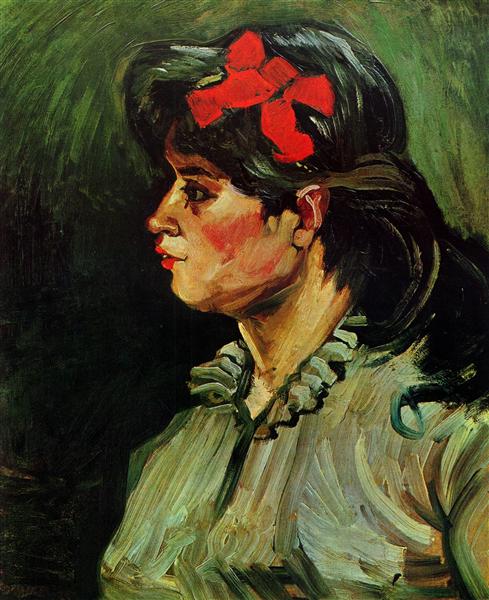
In Vincent van Gogh's painting, Portrait of a Woman With a Red Ribbon below, I would say that the artist really wanted to make that hair ribbon, those juicy red lips & her ruby cheeks stand out by choosing red's complimentary color of various shades of green, in her hair, blouse & in the background.
Wow, what a vibrant & intense affect using these 2 complimentary colors has on this painting!
The third color technique I used in the poppy painting is temperature.
Warm colors which range from yellow to orange to red, tend to "push" an object to the very front of the canvas. Whereas the cool blue to violet range makes things recede, they appear further away.

In the poppy painting I wanted the poppy to jump right off the canvas, so I increased the color temperature of the flower (warmer), and decreased the color temperature of the background & the center (cooler). This makes the background recede, the center to look more "pushed in", and allows the poppy to take center stage as if it's bursting out of the canvas.
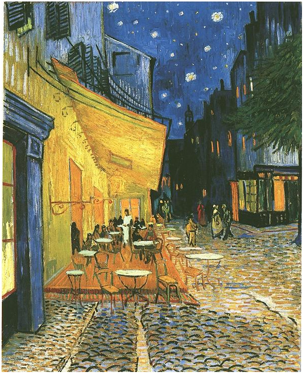
Below is Van Gogh's painting, "The Café Terrace on the Place du Forum, Arles, at Night". He used many of the same techniques I've described above.
Warm colors were used to bring the awning & terrace closer to the front, and the use of cooler blue & purples allow the buildings & night sky to recede further into the background.
Also notice he uses blue's complementary color orange in the windows of the blue buildings, their glow drawing your eye back along the street to the people wandering home after a night of drink & socializing.
When working with color an artist should first decide on the story or emotion they want to convey. By doing this right from the start, it makes it easier (& more fun) to choose which colors to use to communicate this particular mood or tone.
I encourage you, whether you're making or collecting art, to browse art festivals, galleries, museums, art books etc. so you can increase your visual catalogue, and by doing so you'll also improve your ability to "get" art at a whole new level.
The more you observe the art around you, the more useful information you'll have to work with. Awareness & observation skills take time to develop, but the more you do it, the more automatic it will become, and the better creative choices you will make ... so be sure to look, look, look!
Now it's your turn...
What are your favorite color combinations when it comes to art work? Has this blog post shed new light on the use of color in your favorite paintings? What do you enjoy most when wandering thru a gallery, museum or art festival? Is it absorbing the color? Or do you enjoy learning about different art mediums? Or maybe it's the promise of lunch afterwards! Lol.
I'd love to hear all about it in the comments below. Your artistic voice & heART matter to me ... always!